The previously mentioned painting by my darling maman has now made it to the wall above our bed, making it even sweeter to snuggle in at night. As silly as it may sound, it seems to "make" the room and pulls everything else together. The only downside is that I realised I felt odd posting a picture of where I lay my head on the internet. You see, me and my bed have a special bond. I love my bed and I am known to say this aloud several times in a week. Some things you just have to keep for yourself. Above is the masterpiece waiting by the fireplace, I hope this will suffice for now. The cushions belong on the bed but the birdcage lives right where it is, as do all the other bits and pieces.
These pyjamas by Sussan (store of choice for lovely jim jams) were the starting point for the painting as I just loved them in every way. The repetitive print proved a problem in that there would be no central point for the painting. Enter Aesop, an Australian skincare company that delights with exquisitely scented plant-based products and an admirable ethos that shines through in all that they do. Even their sample sachets are printed with inspiring, thought-provoking quotes. Attention to design in their packaging, stores and advertising is obvious, yet somehow understated.
This ad (above) tickled my fancy and provided some stronger design elements that were much-needed in shaping the eventual painting. Not being one for peachey tones, I stayed true to the aqua/blue and dusty rose colours from the pyjamas. Sadly, I wore and burst out of these babies in the two years it took for the painting to be completed. Maybe just as well. Wouldn't it be slighly odd for your nightwear to match your boudoir?
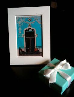
A penchant for Tiffany blue (PMS 1837) also cemented my colour choices. I'm sure you know the colour, but just in case you are blissfully unaware, pictured below is a Tiffany & Co box with a postcard photo picked up at a Manly (Sydney, NSW) market and inserted in an IKEA frame. The colours in both are quite different but I like that it's not all exactly matching in a cold, showroom way.
In saying that, I did carry this colour palette in my handbag for quite some time to help me find suitable cushions (perhaps too long if the wrinked cardboard is anything to go by).
At one point, I spotted what I thought were perfect cushions in a Fantastic Furniture catalogue only to find that the green florentine print on cream wasn't right when I saw them in the flesh. BUT THEN, out of the corner of my eye, I spotted some silky ones in the CLEARANCE bin! Maybe there is a God! As you can see in the first picture of this post, I chose one with a diamond print and two with a florentine print. From memory they were less than $15 each. The candlesticks on the mantle are another bargain purchase from an impromptu trip to Oz Design, Hoppers Crossing. I believe we were 2km into a 30km trip home when we stopped off. My head was pounding from too many cocktails the night before but I can spot a bargain anywhere, anytime. Paying full price makes my jaw clench in a convincing resistance that is hard to ignore. It is all too easy to hand over the plastic and settle on the first full-priced item you see that fits your project. Easier still for me to to say when I had oodles of time to pull this room together while waiting for inspiration to hit the painter. For now though, resist the urge I say and enjoy the hunt.


No comments:
Post a Comment