Choosing just one thing is so very hard. I love too many things. It's a curse. When it comes to lighting there are three styles I'm considering for our dining area - industrial light shades, bare dangling bulbs and chandeliers. I've shown you the room to date with the fresh paint in Domino (black) and Whisper White, so now it's time for some inspiration for the finishing lighting touch.
INDUSTRIAL LIGHT SHADES
The coolest industrial shades are the ones that look like they came out of an old factory, albeit an immaculate one with original lighting in pristine condition. The style in the first image is my favourite and there are usually similar at Pomegranate in South Melbourne (with a hefty price tag).
Source: decorpad
Ikea sells light shades like the ones in the next image.
Source: interi0r-design.com
Source: Shelter Interior Design blog
Shades similar to those below are often on eBay for reasonable prices (but I can't overlook that lights should be installed, at a price, by a qualified electrician).
Source: Elle Interior. Styled by Kråkvik & D'Orazio and shot by Siren Lauvdal.
BARE, DANGLING LIGHT BULBS
This look is inspired by my two favourite eateries of 2010 - Gigibaba and The Hardware Societe. They weren't the most expensive dining experiences, but they were the most exciting, starting with their beautiful interiors and attention to detail. Their quirky and delightful lighting is etched in my memory. Surely I will master the macaroon a la the Hardware Societe if my kitchen and dining has the same lighting?! Mmm...
This look is inspired by my two favourite eateries of 2010 - Gigibaba and The Hardware Societe. They weren't the most expensive dining experiences, but they were the most exciting, starting with their beautiful interiors and attention to detail. Their quirky and delightful lighting is etched in my memory. Surely I will master the macaroon a la the Hardware Societe if my kitchen and dining has the same lighting?! Mmm...
Source: Broadsheet. Photo of The Hardware Societe by Josie Withers.
Source: The Age. Photo of Gigibaba, Collingwood.
CHANDELIERS
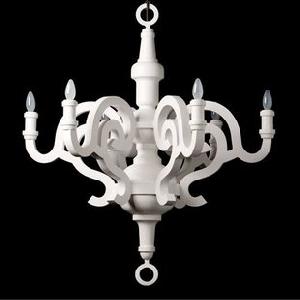
A little drama is good but too much bling is poor taste. Therefore, a chandelier should create a splendid scene but it should not have a lot of dangling crystal going on. Me likey these:
A little drama is good but too much bling is poor taste. Therefore, a chandelier should create a splendid scene but it should not have a lot of dangling crystal going on. Me likey these:
Source: House & Garden (Gwyneth Paltrow's home)
Source: Moooi - Paper chandelier
And something to make the oldies eyes pop. THIS on top of a black wall? Oh yes, and it makes a smile push at the corner of my lips. Irresistible!
And something to make the oldies eyes pop. THIS on top of a black wall? Oh yes, and it makes a smile push at the corner of my lips. Irresistible!
Source: M Stetson Design


Ooo I really like that yellow chandelier! Could you stand for a pop of color in your space?
ReplyDeleteI'm a sucker for lighting!
ReplyDeleteThanks for your visit, your blog is beautiful!
XO
I want to say industrial but because I know you personally I choose chandeleir. And since we have read about the yellow chair before ... I vote yellow chandeleir! BTW I LOVE the black!
ReplyDeleteThat woudl be ***chandelier***.
ReplyDeleteGot my fingers tangled!
Electrical wires are color coded to prevent wiring errors.Electrician Melbourne
ReplyDelete